Download
 Browser
Great retro character portraits do not rely on high resolution. They rely on decisions that survive tiny canvases: a silhouette you recognize at a glance, an expression that reads in a dialogue box, a cast that looks like one art pass, and enough contrast to pop on old screens. From Game Boy Advance tactics games to SNES shooters, TurboGrafx RPGs, and PC-98 adventures, the best portrait sheets share the same craft — even when the hardware could not agree on color depth.
This guide walks through standout portrait work from classic and late-era games and names the techniques that make those faces stick. Use the examples as a study map: cast mugshots, battle cut-ins, expression economy, hip-up posing, consistent palettes, high-contrast attitude, limited neutrals, white sparkle, cast templates, dithered soft shade, and modular mugshot grids.
Cast mugshots — Fire Emblem (GBA)
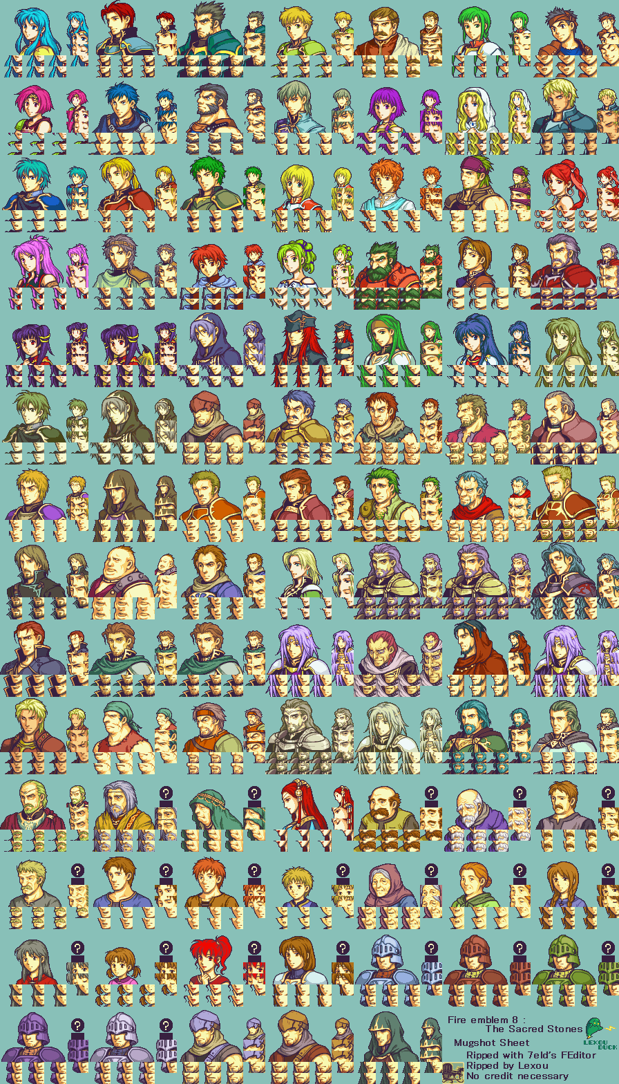
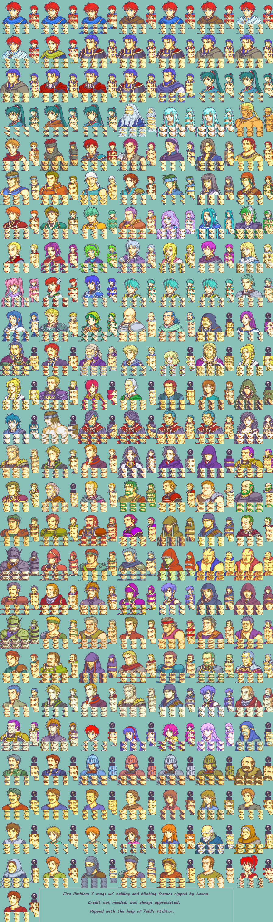
A big cast only works if every face belongs to the same system. The GBA Fire Emblem games lock the whole army into matching mugshot frames — same crop, same lighting direction, same outline weight — so Eirika, Eliwood, Lyn, and dozens of allies still feel like one art pass when they appear in dialogue.
Look at how little each head needs to stay unique: hair silhouette, armor accents, and a few expression swaps do the heavy lifting. At GBA resolution that consistency is the craft — you can drop any unit into a text box and the portrait still reads as Fire Emblem, not a random sprite. Compare The Sacred Stones and The Blazing Blade side by side: same template discipline, different roster scale.
Mugshots and battle cut-ins — Dragon Ball Z: Attack of the Saiyans
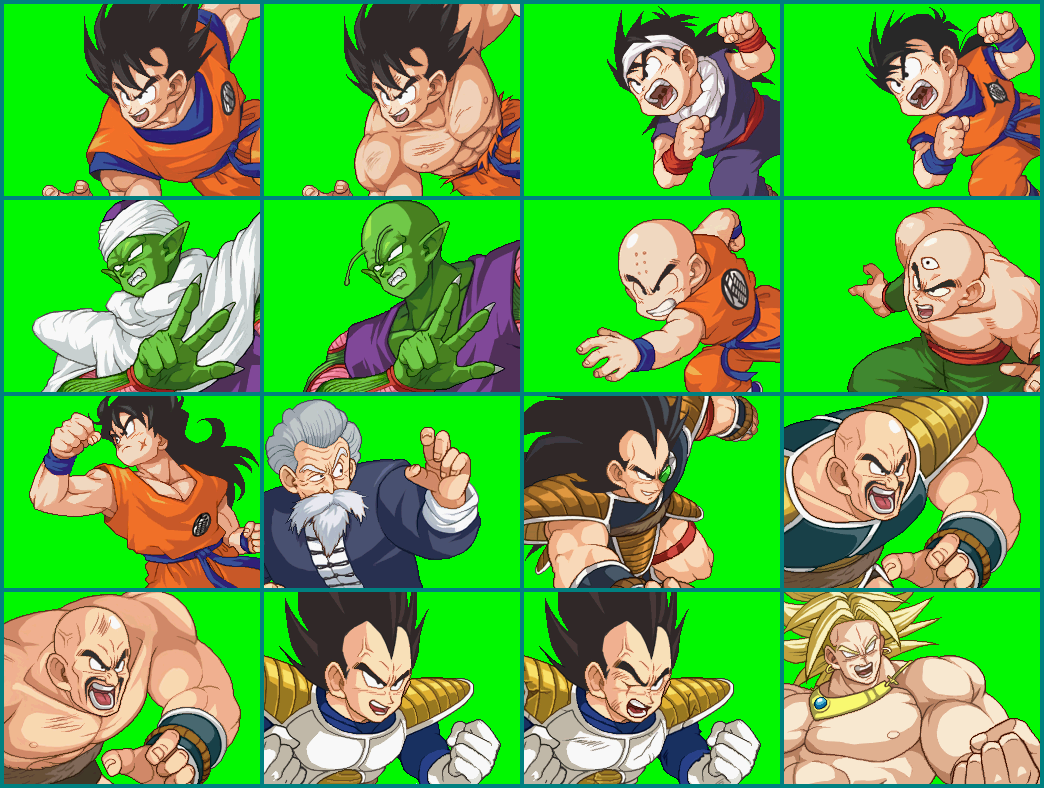
On Nintendo DS, Dragon Ball Z: Attack of the Saiyans splits portrait duty the same way a lot of strong RPGs do: small mugshots for dialogue, bigger cut-ins when a fight needs impact. Goku, Vegeta, Piccolo, and the rest share matching head frames for menus and story beats — same crop, same outline weight, expression tiles that swap without breaking likeness.
The battle cut-ins push the same cast into wider poses and sharper acting: clenched fists, shouting, wind-up attacks. Same characters, two budgets — compact heads for pace, framed action for drama. Study how the mugshot sheet keeps the roster tidy while the cut-ins let each fighter flex personality when it matters.

Expression economy — U.N. Squadron
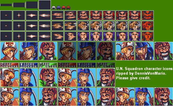
Expression sheets are a masterclass in doing more with less. In U.N. Squadron, Shin Kazama, Mickey Scymon, and Greg Gates each get a handful of faces — neutral, shocked, shouting, smiling, winking — built from the same helmet, hair, and lighting. The likeness stays locked; only the eyes, brows, and mouth move.
That constraint is the point. At SNES resolution you cannot animate every muscle, so great pixel portraits sell mood with a few high-contrast shapes: a widened eye, a clenched jaw, a sweat drop. Study how the larger dialogue portraits keep the same value structure as the tiny HUD icons. If the expression still reads when you zoom out, it will survive on a busy screen.
Hip-up designs — Namco × Capcom
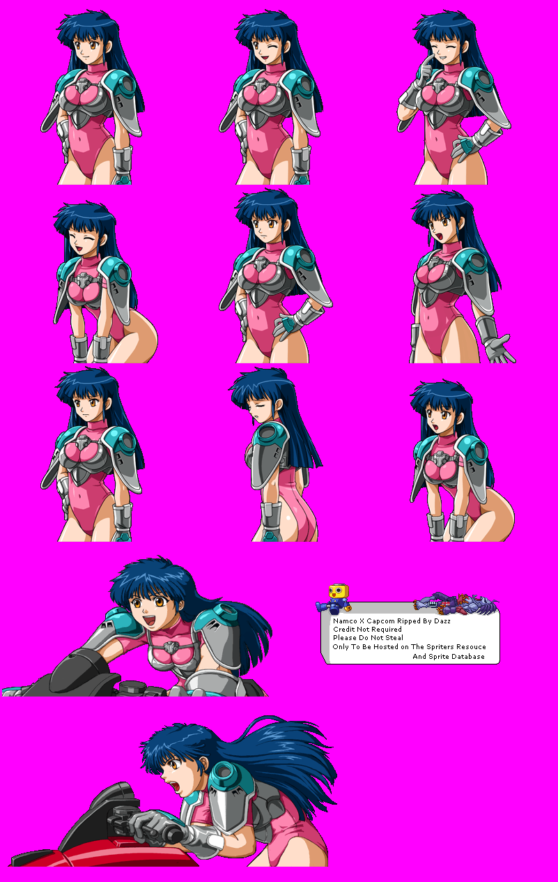
When a talking head is not enough, hip-up portraits give you costume, posture, and props without the cost of a full-body sheet. Namco × Capcom leans on that format hard — Gilgamesh and Hiromi both keep a readable silhouette from the waist up while swapping gear, gestures, and mood.
Look at how each set varies without redesigning the character from scratch. Gilgamesh cycles helmet on vs off, arms crossed vs at rest, shield sizes, and a darker “altered” variant. Hiromi pushes the same idea with costume swaps, hip-up acting — hand on hip, wave, lean-in, victory pose — and bigger action cut-ins. Those custom changes are how a single design covers story beats, status, and cut-ins while staying instantly recognizable.

Consistent cell shading — Tales of Phantasia
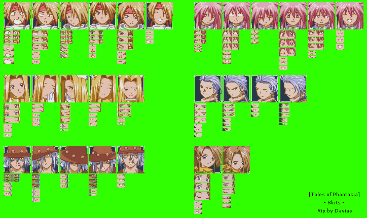
The skit portraits in Tales of Phantasia show how a cast stays cohesive when every face shares the same rules. Cress, Arche, Mint, Chester, Claus, and Suzu each get distinct hair and costume colors, but skin ramps, outline weight, and lighting stay consistent — so the party feels like one art pass, not six separate styles.
The look is simple cell shading: flat fills, a couple of shadow steps, and clean silhouettes. Softness comes from light anti-aliasing — single intermediate pixels along hair edges and curves — enough to calm jagged diagonals without muddy blending. Under each base portrait, eye and mouth tiles swap independently for dialogue animation. That modular setup is why so many expressions feel alive while the palette and line style never drift.
High contrast and attitude — Yu-Gi-Oh! Dark Duel Stories
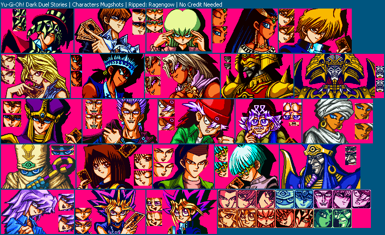
Game Boy Color mugshots in Yu-Gi-Oh! Dark Duel Stories lean into classic series swagger: spiky hair, sharp brows, and faces that look ready to trash-talk across the table. The portraits punch above their pixel budget because they push contrast hard — thick blacks, saturated costume colors, and deep shadow shapes that still pop on a non-backlit screen.
Attitude lives in the silhouette and the eyes more than in fine shading. Expression tiles beside each mugshot swap anger, smugness, or surprise with tiny mouth and eye changes, while the main chest-up pose — often with cards in hand — keeps the character’s personality locked. When you want portraits that feel loud and iconic at a small size, this is the reference: fewer midtones, stronger shapes, more attitude.
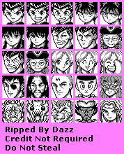
Four neutrals — Yu Yu Hakusho
Strip the color away and a portrait has nowhere to hide. The Game Boy mugshots in Yu Yu Hakusho run on four neutrals — black, dark gray, light gray, and white — yet Yusuke, Kuwabara, Hiei, Kurama, and the rest stay instantly readable. Hair spikes, brows, and accessories do the heavy lifting; value clusters separate face from hair from outfit without a single hue.
That is the lesson of a strong character design under a hard limit. Dithering softens a few shadows, but identity comes from silhouette and contrast, not from a wide palette. If a face still works in four grays, it will only get clearer when you add color later.
Vibrant color and white sparkle — Popful Mail
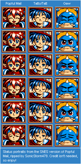
The SNES status portraits in Popful Mail show how far a simple, consistent pass can go. Mail, Tatto, and Gaw share the same frame language, outline weight, and expression ladder — happy, calm, alert, sad — so the cast feels like one sheet, not three different artists.
What makes them pop is the color stack: saturated midtones, deep black for structure, and crisp white highlights on hair, armor, and eyes. Those white sparkles are cheap to paint and expensive in impact — they sell shine and life without muddy gradients. Keep the style simple, keep the contrast honest, and small portraits will still read across a busy UI.
Reaction ladders — Magical Drop 3
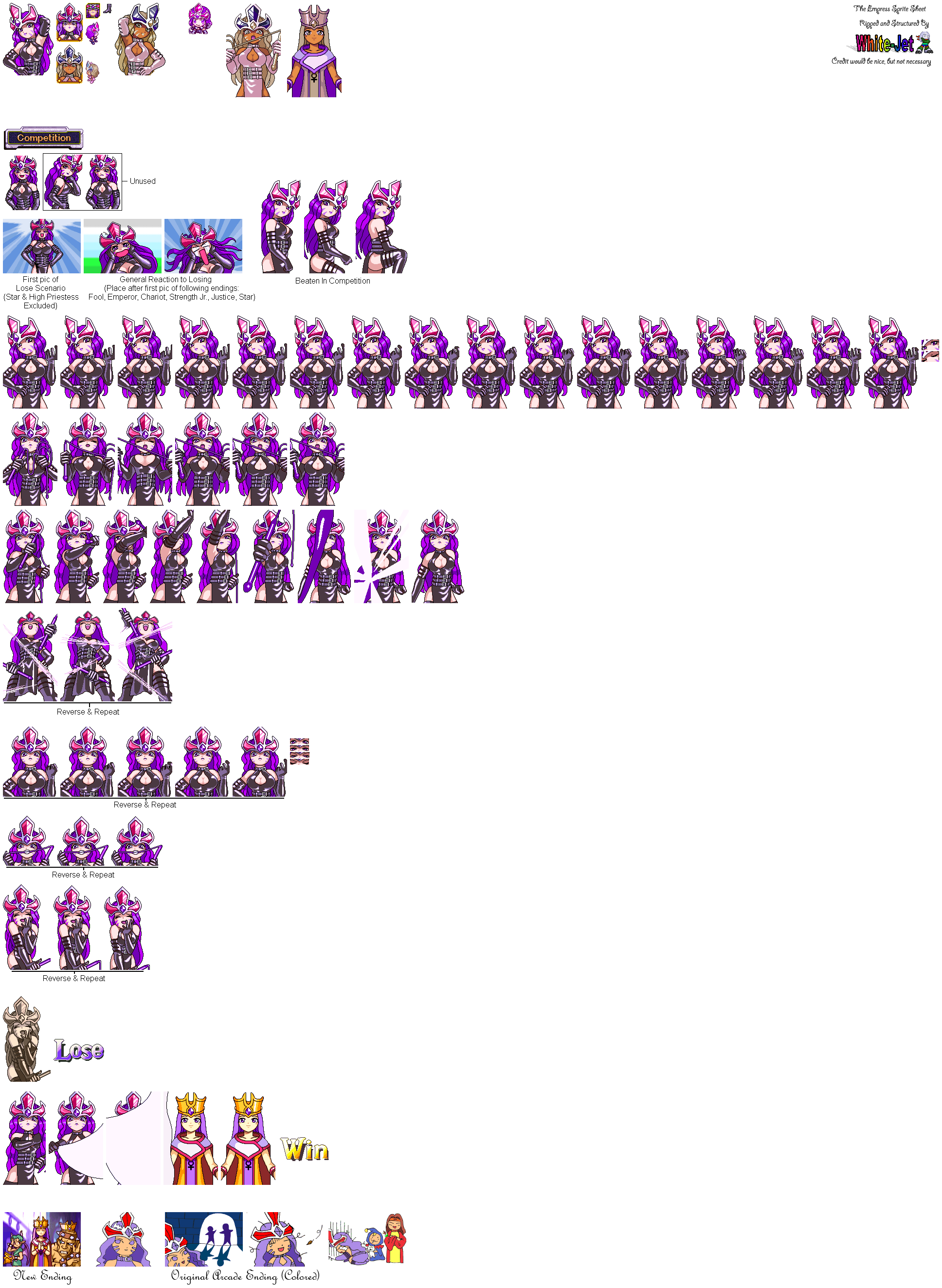
Puzzle games still need portraits that sell every beat of a match. In Magical Drop 3, The Empress gets a full reaction ladder on one bust-up sheet — neutral, smug, shocked, cheering, defeated — all built from the same hair, crown, and costume silhouette.
That is expression economy at character scale: the likeness never drifts, but the face and posture carry win streaks, close calls, and story-mode trash talk. PlayStation-era polish helps — smoother shading and cleaner curves — but the craft is the same as on 16-bit hardware: lock the design, then swap eyes, mouth, and gesture until one hero covers an entire emotional arc.
Cast-scale talking heads — Langrisser II
Strategy RPGs need dozens of faces that still feel like one world. The Sega Genesis portraits in Langrisser II solve that with a strict talking-head template: same crop, same eye line, same expression beats — neutral, speaking, eyes closed, wounded — repeated across knights, mages, and monsters alike.
Solid colored backdrops do half the readability work. Bright blue, red, green, or purple panels push each silhouette forward in a dialogue box, while sharp highlights on hair and armor keep Genesis’s limited palette from going muddy. When you are building a big cast, lock the framing first; then let costume color and a few mouth and eye swaps carry personality and status.

Dithering and soft shade — Welcome to Pia Carrot!!
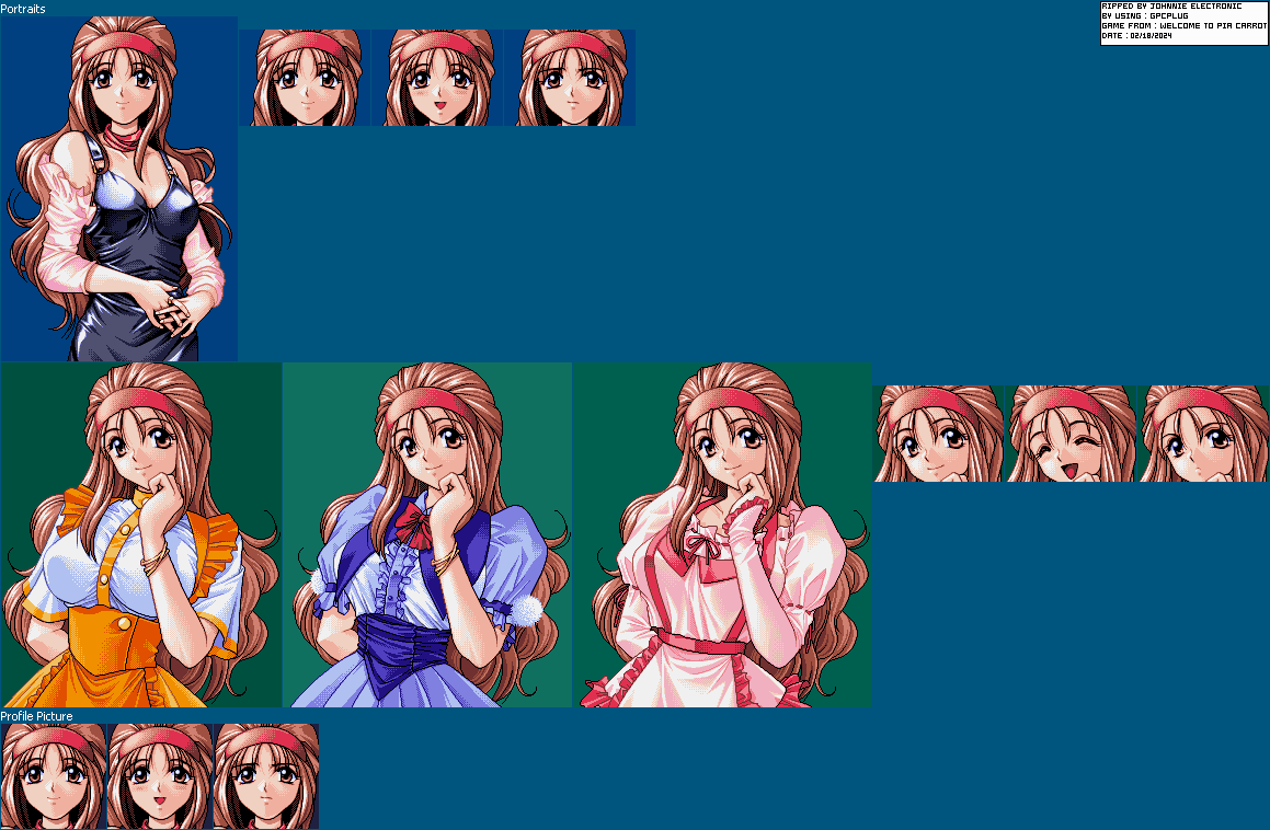
PC-98 portrait work often looks richer than the hardware “should” allow. Reika Kokubo’s sheet from Welcome to Pia Carrot!! is a clear case: waist-up poses, outfit swaps, and smaller profile icons all share the same polished finish — clean line, careful eye shine, and fabric folds that feel soft instead of chalky.
The secret is disciplined dithering. Checkerboard and tight ordered patterns stand in for missing midtones on skin, hair, and cloth, so shading reads as a gradient without muddy blends. Pair that with a few hard white accents on hair and eyes and you get depth that still holds up when you zoom in pixel by pixel.
Late-era polish — Robot Alchemic Drive
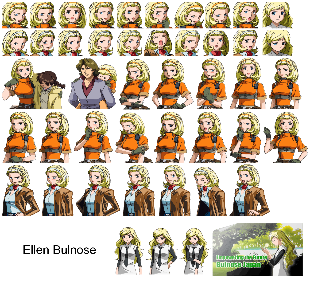
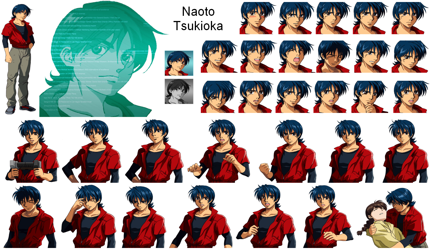
By the PlayStation 2 era, portrait sheets could carry full acting without looking like HUD stickers. Robot Alchemic Drive’s Ellen Bulnose and Naoto Tsukioka sheets stack dialogue faces, posing, and select or cutscene variants in one place — still pixel art, but with smoother ramps, clearer silhouettes, and expression changes that feel cinematic at a glance.
Use them as a bridge study between early talking heads and modern indie sheets: keep the modular expression idea, then push shading and body language further. When a cast needs personality beyond a 48×48 mugshot, this is how far a consistent portrait system can stretch.
TurboGrafx flair — Galaxy Fraulein Yuna
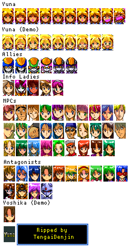
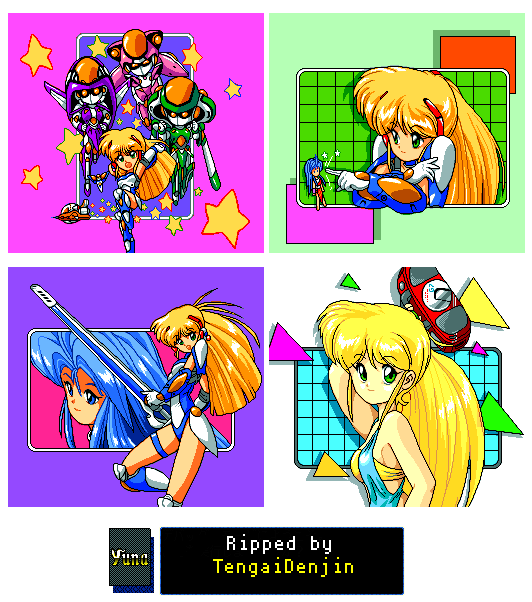
Ginga Ojousama Densetsu Yuna (Galaxy Fraulein Yuna) shows how TurboGrafx-16 portraits can still feel glamorous under a tight color budget. The dialogue portrait sheet keeps faces bold and readable; the intermission pictures stretch into bigger posed beats between stages.
Study the pairing: small talking heads for pace, larger framed pictures for impact. Same cast language, different crop budgets — a useful pattern whenever a game needs both HUD chatter and showcase moments.
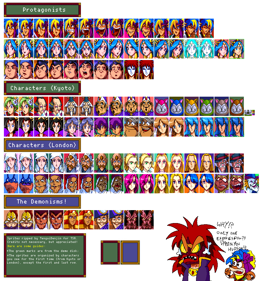
Mugshot grids — Tengai Makyou: Fuun Kabukiden
Another TurboGrafx-16 lesson in packing a big cast into tiny faces: the mugshots from Tengai Makyou: Fuun Kabukiden keep every character on the same scale and framing so dialogue and menus stay tidy. Distinct hair, hats, and silhouettes do the identification work; expressions stay simple enough to swap without redrawing the whole head.
When a roster grows, this grid approach is the discipline check — one size, one eye line, endless personality through costume and shape.
What to take away
Across every sheet above, the same principles keep showing up:
- Lock the likeness — change eyes, mouth, and brows before you redraw the whole face.
- Choose a crop on purpose — head-only for HUD chatter, hip-up when costume and pose matter.
- Share one style pass — matching outline weight, skin ramps, and lighting make a cast feel unified.
- Push contrast — thick blacks, saturated midtones, and sharp whites beat muddy midtones at small sizes.
- Design for limits — four grays, a Genesis palette, or heavy dithering can still look gorgeous when the silhouette is strong.
- Template the cast — same eye line and frame size scale better than one-off hero art for every NPC.
If you are studying pixel art character portraits, start with one sheet, pick one principle, and redraw a single face under that rule. The games already solved readability, expression, and cohesion under brutal constraints — the best teachers are still hanging in those sprite sheets.