Download
 Browser
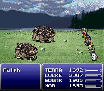
UI icons fail when they only look good zoomed in. Design at the final size, keep contrast high, and steal readability tricks from inventory UIs like Final Fantasy VI.
What you'll make
A small set of 16×16 icons that still read on dark and light backgrounds.
Rules
- Work at the final display size (often 16×16 or 24×24).
- Enable Pixel Perfect on the pencil for crisp corners.
- Limit your palette to a few high-contrast values.
- Check icons at 100% zoom — if the shape reads at 1×, detail can follow.
- Test each icon on both a dark and a light fill before you ship the set.